It was almost one year ago that I dicovered this web.
http://digital-photography-school.com/
And I can't but recommend it. Explore every corner, because it's worth.
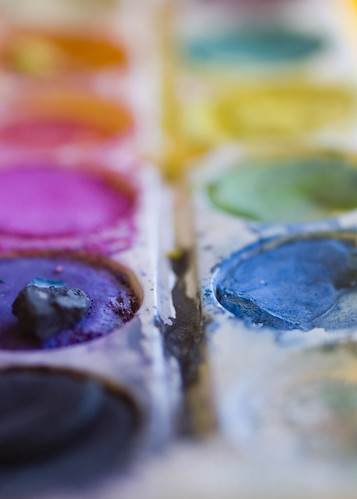
And, surf the forum, especially the Weekly Assignments. You'll find extraordinary work, and suggestions for you to try. This week, the assignment was "Shallow Depth of Field". The examples shown there are simply awsome.This is my submission for the assignment:
The "Share your Shots" section is always boiling with new submissions.
And there's lots more, including tutorials for all levels, equipment, processing, etc.
Visit the web, and you'll meet lots of Photography enthusiasts, always willing to comment, help, anything. It's a warm welcoming community, headed by Darren Rowse and a group of very valuable moderators.
Sunday, March 29, 2009
Tuesday, March 17, 2009
Musical instruments
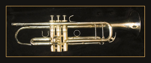
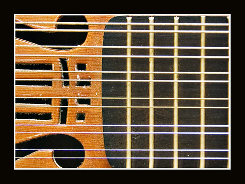
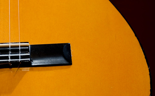
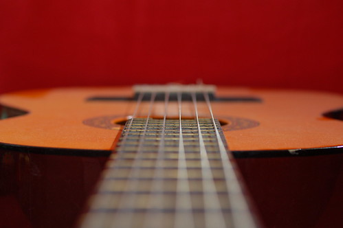
Musical instruments are perfect models for creative shots.
Most have a special look, something mysterious in them, the softness of the metal, the color of the noble materials...
And most tell a story about the users, their love for their instrument, and their feelings for music.
All this makes a trumpet or a violin, or any other instrument an inspiring model, easy to photograph if you care for it.
Just look for shining parts, different perspectives, new aspects.
And let yourself get carried away by music.
Have a try. Owners of musical instruments are so proud of them that they will like a session with or without them in the photos.
Thanks Agus and Gabriel, for your trumpet, guitar and laúd.
Saturday, March 14, 2009
erik johansson
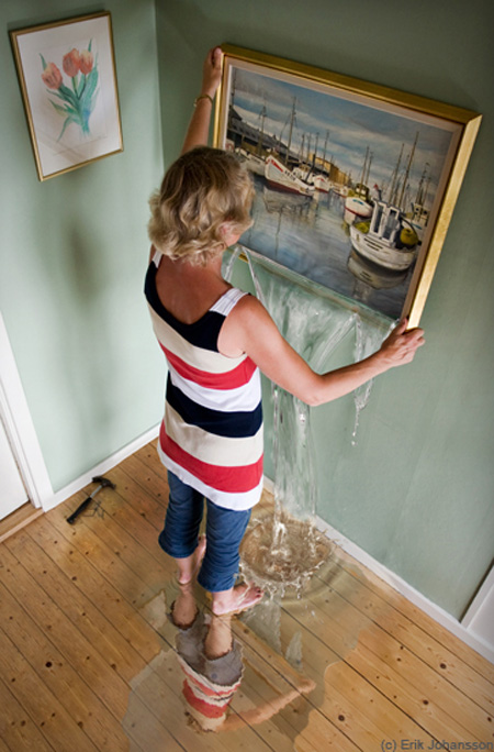
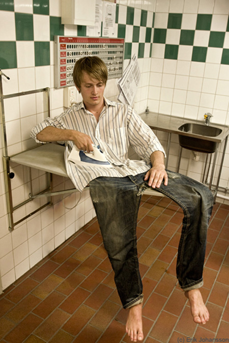
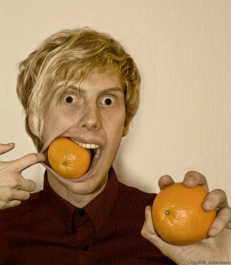
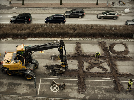
Have a look at these images:
What images do they bring to your mind? To mine, Escher, modern, bright, brilliant.
The artist is Erik Johansson, a Swedish photographer. Check his website, it's worth: http://www.alltelleringet.com/
At only 23, he's doing these perfect impossible photo-manipulations. The original images are really quality, the technique to process them,flawless. The result, brilliant.
His originality is remarkable: the ideas are fresh and simple,full of wit and humour.
Visit his website and enjoy the images.
Thanks to Toxel.
http://www.alltelleringet.com/
Thursday, March 12, 2009
First portrait session.
Wow, I was quite anxious, as I didn't know how it all was going to turn out. Anxious and eager, although not very self confident.
Things went on very nicely, Eva was very relaxed, and enjoying the session.
And this is the result, part of it:
Ughh, that shadow gives me away as a newbie in technique: I learn what I have to improve. First thing: Avoid shadows, control light!
We played with backdrops (bed sheets) to get different effects. Then photoshopped to frame and enhance the shots.
Hope you like them.
Things went on very nicely, Eva was very relaxed, and enjoying the session.
And this is the result, part of it:
De eva |
De eva |
Ughh, that shadow gives me away as a newbie in technique: I learn what I have to improve. First thing: Avoid shadows, control light!
We played with backdrops (bed sheets) to get different effects. Then photoshopped to frame and enhance the shots.
Hope you like them.
Tuesday, March 10, 2009
Fifty-two
Hi.
I have just started my fifty-two.
What's that? Flickr group.
Administrated by Wulf or basswulf.
Fifty-two means that you are going to take and upload a selfportrait a week during one year, so fifty-two portraits.
This task compels you to think of new aspects of you, to experiment with tecnique, composition, etc. Your model is not going to complain; and, on the other hand, you are forced to do something most photographers don't like but have to learn: self portraiture, a difficult and sometimes disappointing art, but very gratifying when you start getting good results.
Here is my opening shot,
And the second:
This second shot has a long process behind it:
1-Took image with Panasonic, holding my Nikon
2-As the Nikon wouldn't read the file, opened it in my PC
3-Photographed PC screen with the Nikon
4-Photographed Nikon back screen with Panasonic!
Monday, March 2, 2009
Why RAW?
Jpeg is the universal format for photos taken with digital cameras. But there's something else: RAW.
Raw format was something I wasn't interested at because I thought it was for pros. But then one day I tried. Since then, I never shoot other than RAW, or better, RAW+jpg, a big raw file ans a small light jpeg one, to be used when you want a fast check.
Let's go practical about the wonders of this format:
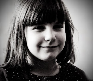
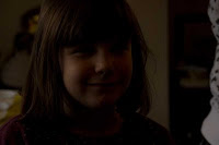
I took this image at my daughter's birthday. Had it been in jpeg, I would have thrown it to the bin without a doubt.
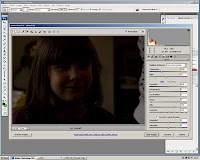
Now, watch the process in Adobe Camera Raw, a plugin for Photoshop, to work with this kind of format.
First, open the shot:
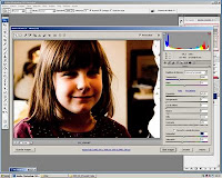
Then start adjusting levels: exposure, black, white, light, etc:
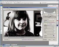
See how it improved? Let's go further, with desaturaturation and exaggeration of black and white and light:
Now, we're finished. Click to open it in Photoshop and go for the final adjustments, say crop and background fix.
And here we are, the final black and white that appears at the beginning of this post.
Don´t you think it's worth trying?
Subscribe to:
Posts (Atom)