Saturday, February 28, 2009

more on textures, sorry...

I think I'm hooked on them.
This is Patricia. I did the same technique of adding a textured background on her. And this is the result:


For those of you who liked textures, here you have some, should you want to experiment with them. Feel free to download and use them.


Why not using them as brackground?
If you have any questions on using them, email me.
Thanks for looking.

Sunday, February 22, 2009

textures

I admit I have a soft spot for textures. I collect shots of textures for two reasons: First, because I like them, and second, to combine them as backgrounds.
Look at this:

It is the result of combining these two:

and
Hi, it's me

The important thing about textures is the blending mode.
The process here was the following:
First I opened the texture file, then the portrait. I copied the portrait on to the texture, on a separate layer. I liked the effect of the second being smaller than the texture, and so creating the effect of a frame.
And then I simply chose the blending mode for the portrait:

Experiment with all the modes, it's worth. Sometimes the results are amazing, and unexpected.
Hope you enjoyed this post.

PS: Check KKH Photos for superb examples of textured portraits.You will like Karen's work.

Saturday, February 21, 2009

play with brushes

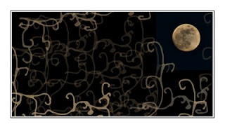
Not in a very good mood today -dunno why- and absolutely not happy with this full moon, with not much detail, I decided to give it a go with brushes:


Brushes are just fascinating. And you can find the most beautiful, the most creative ones, available for you to download, just googling for "free brushes".
But I wanted to create mine, my own set of brushes.
First I tried vector shapes, only to end up rather disappointed, leaving it for next time at Fireworks or some similar software.
So I went for the easy way: Just draw, and convert into brush, with minor adjustments.
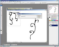
To start with, as always, create a new document, and start drawing the lines and shapes that you'll want your brush to reproduce.


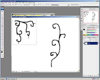
When I had the set that I liked -a shape for corner, one for horizontal display and one for vertical. Once you have started, my advice is to do all the set, for all the possible needs, I mean, four corners, separate small motive, long one, etc.

In order to make them nicer I used a Photoshop filter, in the artistic group. Try different filters for different aspects.


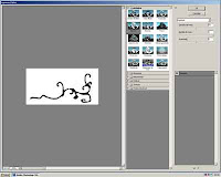
Now we're almost done. Select each shape, using any selection tool, I used the rectangle tool. Once you have selected one, convert it into a brush, in edit> define brush values:


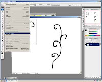
Give it a name. Really this step is not important, as it will be given a number by PS, and you'll find it and the end of the list of brushes.
Anyway, I always do, I always give my brushes their proper name.


Then, your brush is ready to be used.
Open any photo, select your new brush, then check that you can play with its color, size, and opacity.

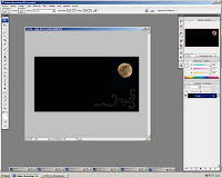
Using a low opacity, say 35%, you can modify the color. or its intensity: you click once, and you get a slight hue, click again and again, and you'll see the difference.

And this is it!
Next time I will have investigated about vectors.

Saturday, February 14, 2009

signature on your photos

Signed photos made me curious. How was it done?
I started investigating and found a decent way to do it:


First we start with the signature. I used a Tablet PC, but scanning or photographing a piece of paper with your signature on it will do too.
Open the file in Photoshop:


We erase the backgroung. The best way is the magic eraser tool:

Now the background is transparent. If you have a white bg layer, delete it.


Now, we are going to convert the signature into a brush. To do so, click on edit>brush preferences.


You will be given the option to name your brush. I named it "signature". Then it is stored the last in the list of your brushes.


Now you can use it. Open a photo. Select the brush either on the left panel or the usual right panel, go to the last brush, and there it is!

You can choose the size, the color, the position...

Thursday, February 12, 2009

The sound of colors


I read somewhere about the effect of baking a CD in your microwave oven. They didn't say it would blow up if kept for more than two secs.
But yeah, the result is AMAZING.
**NOTE OF CAUTION: DON'T TRY THIS AT HOME. IT COULD BE DANGEROUS.**
Then thousands of trial and error, until I found the correct setting for the reflection of the colors.

Finally it was:
Cámara: Nikon D50
Exposición: 0.8
Aperture: f/32.0
Lente: 50 mm
ISO: 200

Thursday, February 5, 2009

It's gonna be cold...

... not so cold as it was a few weeks ago, but ...


Do you want to see how temperature dropped dramatically? Keep on reading:

It all started in the kitchen:
In Photoshop, I extracted myself from the kitchen, using filter> extract.


Now the shape can be isolated. I copied it using the magic wand and inverting the selection.


Then pasted the shape on the other photo, the plastic window of my freezer drawers:


Then,flipped horizontally and the blending of layers. I chose multiply blending mode.


Added one more layer, to provide a bit of foggy atmosphere:


I am addicted to Gaussian blur, so I duplicated the layer with myself, and applied filter>blur>gaussian blur, and blended the layer in multiply too.


And finally, the frame: Select with rectagle, copy and paste on new layer, then fusion options, shadow and bisel.