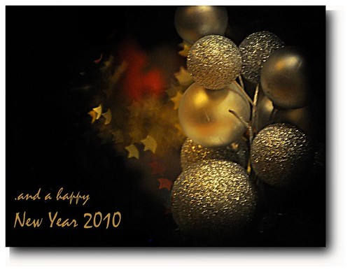
Thursday, December 31, 2009
Wednesday, December 23, 2009
Saturday, December 12, 2009
cats and kittens, more on pets.
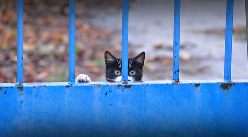
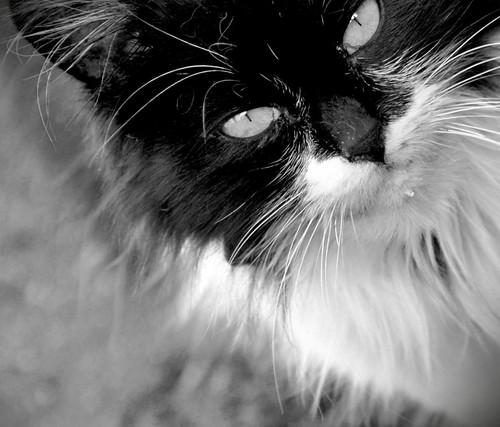
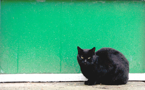
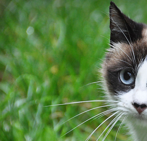
My last find: These twenty cats and kittens, more or less.
They are not exactly stray cats, but their situation is not very good; their owner, who loved each and all of them, had a stroke and now is not able to come and feed them. His family come every now and then, so we are the closest people to feed them.
And they are so pleased to be fed, that they pose, at first quite distrustful and suspicious. But then they saw my camera was not dangerous or so.
Here is the result, here are some of them. They are so beautiful!
Etiquetas:
cat kitten pet
Saturday, November 14, 2009
Delicate. Gradients.
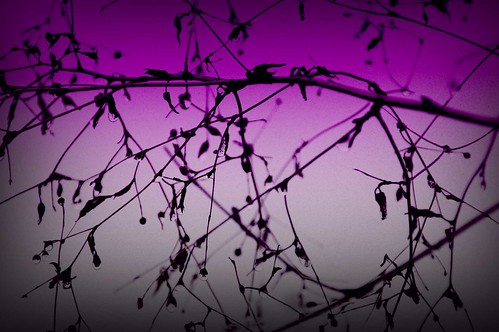
This is the result of using a gradients layer on a picture.
Here is the process:
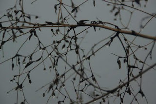
I took this picture on a rainy day. I liked the drops and the lines of the cold plant.
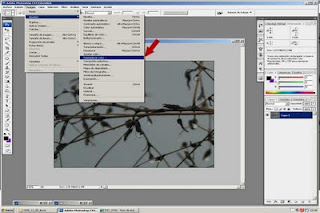
First, open the picture in Photoshop. Then the first step is to change the background color. To do that, go to Image > Adjustments > replace color.
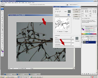
Once there, you'll find the menu for replacement. Select the background with the eye-dropper, then alter the lightness to the maximum.
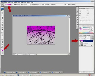
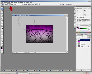
Now it's time to add a new layer. Select the color to use in your gradient. I chose light pink and violet. Then select the kind of gradient you want. In this case it was lineal. Situate the mouse at the bottom of the picture, then move upwards, left button clicked. Experiment with different results, until you get the most convincing.
Then, time for the blending mode. I usually choose overlay or screen. The idea is tomake the layer kind of transparent.
And finally, I added a slight vignette, using a superthick brush, painting very close to the border on a new layer.
The process is quite easy. However, should you have any questions, don't hesitate to contact me.
Hope you liked it.
Etiquetas:
autumn rain layers gradients vignette color
Thursday, October 29, 2009
autumn fruit, textured.
Autumn is here, trees are so beautiful, but I have not had time yet to enjoy my time photographing trees and leaves.
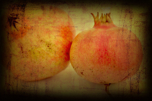
So, at home, I found this treasure: Beautiful pomegranates.
The base is the following
combined with this texture
I applied the texture twice, first as it is, then I turned it vertically to create a slight criss cross of lines. For both textures, the blending mode was multiply.
I hope you like the result. Feel free to use this or other textures at my flickr album of textures.
Sunday, October 18, 2009
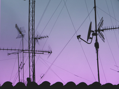
From my window. Sky.
The wiew from my windows is not spectacular at all, but the sky, oh the sky...
The colors in the early morning are just awesome.
The lines of the houses in front seen as silhouettes look more interesting than in daylight.
This sky was not processed.
Here I added a gradient layer, purple to pink and then chose blending mode till I liked the result.
The clouds made the picture.
I have a passion for skies. Lines, colors, clouds, silhouettes, flares ...
Look up and shoot.
Etiquetas:
sky purple red blue lines
Friday, October 9, 2009
Do you know Amy-Rose?
I first knew about Amy-Rose when I saw her work at Digital-Photography-School. I was fascinated at her creation: the color, the clean lines, ... everything was gorgeous!
Then I tracked her at flickr. Really inspirational work. I love the way she sees the world, so full of color.
Then, the blog. Just have a look and you will agree with me: She is an artist of colorful portraiture. She nails it with kids! Hers are a pair of cuties, by the way!
This is Amy-Rose
Check her blog. You'll love it.
And you can enter her contest for her Taste the Rainbow Actions!
Etiquetas:
"Amy-Rose King" photographer rainbow actions
Tuesday, September 15, 2009
Do you vignette?
Vignetting is a technique to add some drama to any shot. We usually think of vignetting as adding a black halo all around the shot,as if slightly framing it.
But vignetting can be done in white or any other color. The most usual, black.
I do vignette many of my photos. It adds an interest sometimes, or focuses the object, or even eliminates some disturbing elements!
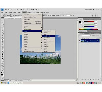
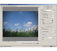
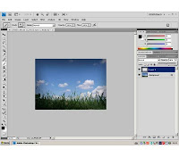
The easiest way to vignette is, in Photoshop, using a filter. It is in filters > distort > Lens correction;
Then the menu for lens correction opens, you click on vignette and use the slide to go to black (left) or white (right) and also the amount of vignetting:
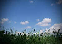
The result is this:
Not bad; but I usually want to have more control of the black space. Then I don't go to filters. What I do is the following:
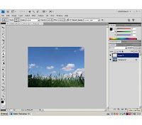
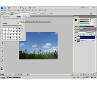
First I create a new layer, then select the paint brush tool, but change the size to an exaggerated number, really big. Then paint just with the border, not the full brush; the center of the brush must be out of the border.
Now you control the areas where you want the shadow to appear. And this way, though the layer opacity, you control the amount of vignette;
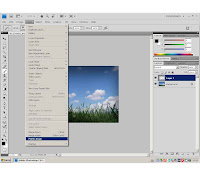
Then, there's only the last step: flatten your image, through layers > flatten layers.
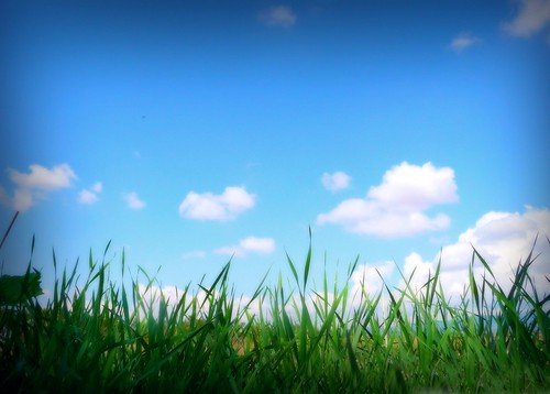
And here is the result:
Hope you like it.
Anyway, experiment, try new techniques, duplicate layers, compare, play with blend options...
Thanks for reading.
Etiquetas:
brush,
lens correction,
photoshop layers tutorial,
vignette,
vignetting
Tuesday, September 8, 2009
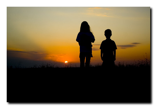
silhouettes. We kiss the day goodnight.
Driving back home after an afternoon out, we enjoyed this awesome sky, getting more and more spectacular. We could not but stop and watch the sun hide, creating a beautiful scene.
Wednesday, September 2, 2009
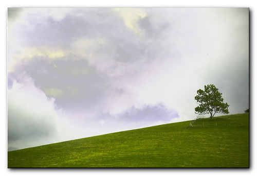
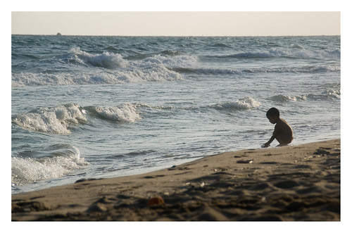
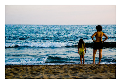
rule of thirds (kind of): summertime.
Hi.
It's been a long, busy and extremely hot summer, most of it without any possiblity of having internet connection!
Back to ordinary routine life, here I am, time for examining every photo I took during this wonderful summer holiday time.
One thing I immediately noticed is how my eye tends to frame every view to make it fulfill the *pseudo*rule of thirds, especially the beach shots, with people. I say pseudo because my thirds are not exact, I tend to exaggerate; (dunno if it's good or bad, but I do).
So I would say that these captures follow a defined pattern that my mind always searches for.
Here are some examples:
Friday, July 3, 2009
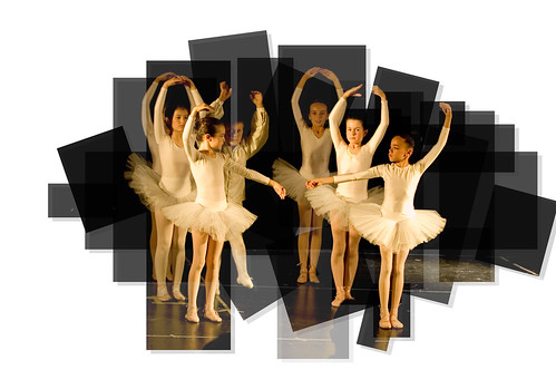
panography: ballet
This is a "false" panography, as it was made from one single photo.
The process is long, but easy.
Start by duplicating the layer (you will have to duplicate it many times, as many as pieces you want in your finished work).
Then, use your rectangle selection tool, select any part you want, then selection>invert selection> cut or erase, so only the rectangle will remain.
Do the same for all the pieces you want. If you want to rotate any, just right click on the selection> transform selection, will give you the option to make it bigger, rotate it, etc.
The final touch comes with the opacity of each piece: I used different opacities, between 70 and 80%, but experiment.
Trick: to see the pieces tha you've already cut, create a white layer, and hide and show it when you need.
Once finished, flatten the image.
Should you have any questions on this technique, feel free to ask.
Have a nice weekend everybody. Thanks for stopping by.
Etiquetas:
photoshop panorama panography layers opacity
Friday, June 26, 2009
butterfly time now
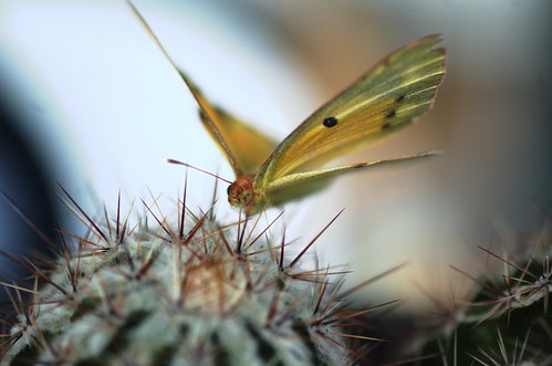
It was midday. It was so boiling hot that even the butterflies and bugs stood quite quiet, even when I went close to them.
She didn't bother me looking at her, which was a pleasure.
This shot is not exactly *real*, I must admit. The butterfly here was posing because she was not really alive. In fact she was very dead(if any one can be *very* dead). I found it stuck to the radiator in my car. It was so beautiful that I kept her and decided to compose the photo with one of my beloved cactus.
I'm sorry for the poor butterfly.
Have a nice weekend, everybody!
Etiquetas:
macro insect butterfly selective focus wings
Wednesday, June 17, 2009
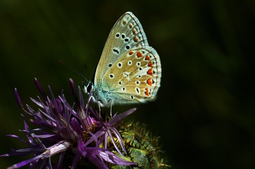
bugs, wonderful models.
Flowers are undoubtedly beautiful. No question in that.
But, when there's "someone" there, they become beautiful and interesting, at least for me!
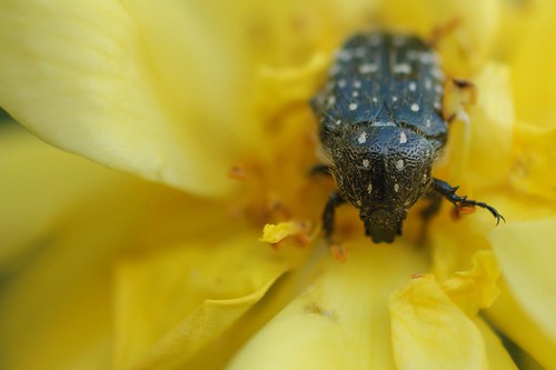
Some are creepy critters but others are simply adorable.
Here are some of my favorite ones.
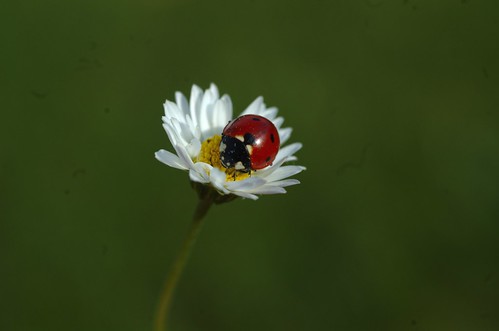
Ladybugs are a must, so round and playful.
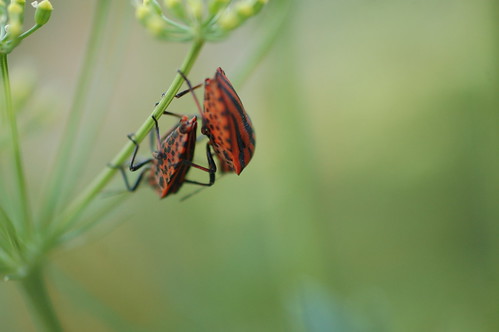
These are playful too! They make a beautiful love scene.
Others are so ugly that they become pretty on flowers.
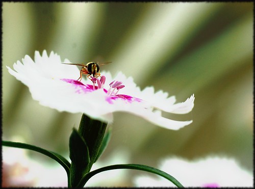
Flying ones are so delicate!
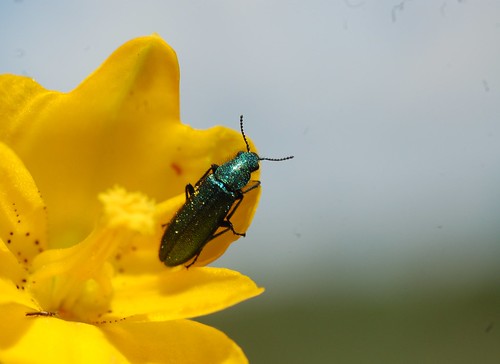
And what about the colors? Look at this electric green! Awesome color.
All you need is a macro lens, although any lens would do, just cropping later, and patience.
A very blurry background will add interest to the shot, isolating the object we want to emphasize. Make your depth of field short, by choosing the smallest f number
Hope you liked my favorite insects!
Have a nice week, everybody.
Sunday, June 7, 2009
color!
Colors are said to reflect your state of mind; then, I'm alive and spirited.
The world around me is right now ...vibrant in colors.
Probably the fact that the past weeks have been so hard with work problems, depressing and disappointing issues have provoked in me a strong desire for breathing colors.
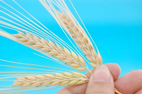
When I think of wheat, I picture it together with the blue sky, and tend to remember a poem by Rafael Alberti,
"Se equivocó la paloma,
se equivocaba.
Por ir al norte fue al sur,
creyó que el trigo era el agua.
Creyó que el mar era el cielo..."
(something like "the pidgeon was mistaken, the pidgeon was wrong, wanting to fly north, it flew south, thought wheat was water, thought the sea was the sky."
Wheat is getting golden now. I love those endless golden fields.
On the other hand, the swimming pool was just painted, ready for the coming summer. I tried the wheat against the sky, but this tuquoise proved more vibrant.
Tried different settings, the definite was f/4; 1/200;
I thought of editing, but was quite satisfied with the result. Would you have processed it? What would you have done to make it better?
Any comments and suggestions are welcome.
Have a nice week. Thanks for looking.
Etiquetas:
color vibrant blue gold wheat alberti
Sunday, May 31, 2009
Stop motion with wolf and pig, by Lordofevil58
Jumping from site to site, I came to this video. It was supposedly related to photography...
And yes, definitely it is. Hard work.
Saturday, May 16, 2009
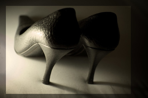
Sepia heels
Wonderful high heeled salons. Make you feel like a film noir actress.
No flash, just garage type lamp close to the shoes.
Cámara: Nikon D50
Exposición: 0.013 sec (1/80)
Aperture: f/2.8
Process:
.General tone: dessaturate a tad;
.Frame: Added a rectangle selection, then right click> new layer via copy. Now I have two layers. I want to create a frame like image, so first layert is altered though image> adjustments>light and contrast, to make it darker and act as the frame.
.Sepia tone: add new layer in layers>new adjust layer>filter. I chose a sepia filter to add softness to the image.
Friday, May 8, 2009
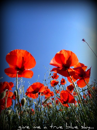
Give me a true blue sky
...and I will glow as red as ever.
Poppies are so vivid in their red that they call for your attention whether you like it or not. The contrasting red on green makes this flower so splashy.
I love this red.
So have a bunch of flashy poppies for the weekend.
This view is done leaving the camera flat on the ground, in the middle of all flowers. I use the little point&shoot as it's flatter than the DSLR and so it gets better angles.
Here I added vignette and words using flickr's picnik.
Have a nice weekend!
Etiquetas:
poppy
Sunday, May 3, 2009
toys to play with... and they are free!
I am very fond of frames and processin through Photoshop, and lately I am starting to experiment with Gimp.
But then, I found something new, free and really fun.
First, the editor that is associated to flickr, which is called Picnik. Most of its options are free, others are offered only for subscribers. I am not, but I have been playing and got some interesting results.
Round corners (to be viewed on white, at flickr, here, on black the effect is spoiled)
some filters
and others: vignetting, adding simple frame, turning to b/w, cropping, adding text... and much more to discover.
Second is Big Huge Labs, also associated to flickr, so that, if you have a flickr account -free or pro- you can edit your photos from and to in a very easy way. But you can also edit photos from and to your computer.
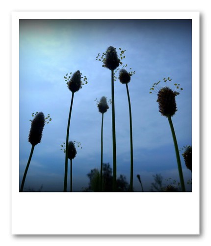
The options are very interesting. I love frames, the polaroid is gorgeous.
and today I tried this:
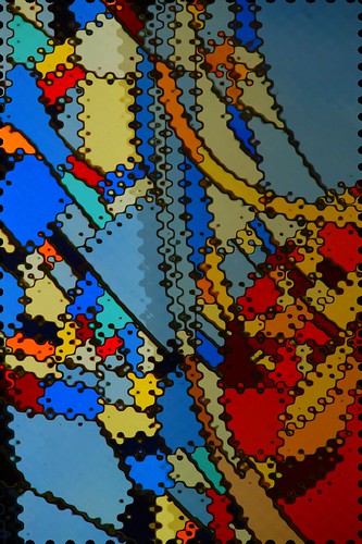
Here I combined both tools: Big HugeLabs made the composition in pieces from a single photo (Hockneyizer) and the words were added in Picnic.
Try these two toys. You will sure like them.
(PS:Happy mother's day, mothers.)
But then, I found something new, free and really fun.
First, the editor that is associated to flickr, which is called Picnik. Most of its options are free, others are offered only for subscribers. I am not, but I have been playing and got some interesting results.
Round corners (to be viewed on white, at flickr, here, on black the effect is spoiled)
some filters
and others: vignetting, adding simple frame, turning to b/w, cropping, adding text... and much more to discover.
Second is Big Huge Labs, also associated to flickr, so that, if you have a flickr account -free or pro- you can edit your photos from and to in a very easy way. But you can also edit photos from and to your computer.
The options are very interesting. I love frames, the polaroid is gorgeous.
and today I tried this:
Here I combined both tools: Big HugeLabs made the composition in pieces from a single photo (Hockneyizer) and the words were added in Picnic.
Try these two toys. You will sure like them.
(PS:Happy mother's day, mothers.)
Thursday, April 30, 2009
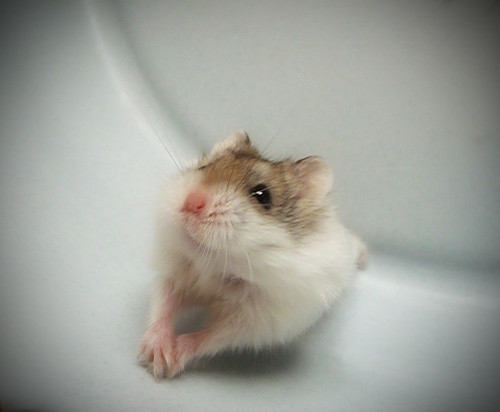
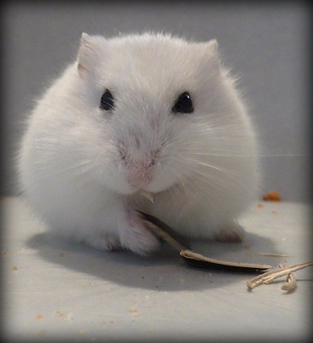
Meet Talu and Pipo
I wasn't very enthusiastic about having pets at home. We had a fish, of which I took just a few photos, as I didn't want to scare him with the flash.
And now we have these two rascals.
They are adorable. Look at them, ain't they cuties?
This is Pipo:
And this is lovely Talu:
They pose like this while we clean their cages. I used the little point& shoot in Continuous shooting mode, very close to the hamsters, so I could capture those beautiful smiles they have.
Subscribe to:
Posts (Atom)